The Offices at Airlie
10 Jul 2017
A commercial property boasts intentionally unique character in a great location
By CHRISTINE HENNESSEY » Photos by G. FRANK HART
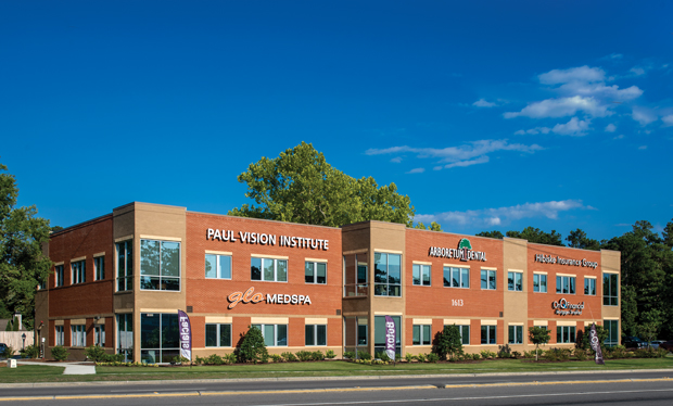
Steve Anderson drove by the wedge of land on the corner of Military Cutoff and Wrightsville Avenue countless times. Previously owned by a farming family, it had once been host to a pumpkin patch and, later, an abandoned house. It then stood empty for years, an unused plot in one of the most trafficked areas of Wilmington. Anderson couldn’t help but think, “What could I do with a piece of land like that?”
This might seem like an odd question for anyone but Steve Anderson. A successful commercial developer in the Port City, his company, SAMM Properties, has built numerous retail buildings and office spaces whose names any Wilmingtonian would recognize—names like Anderson Square, the Offices at Mayfaire, Howe Creek Landing, and the 17th Street Medical Park. Going through the list, you might begin to think Anderson built most of Wilmington, and you wouldn’t be too far off. So it wasn’t a surprise when, after five years of daydreaming about that piece of fallow land, Anderson finally bit the bullet and bought it.
While the unique shape of the land presented challenges, Anderson wasn’t fazed. If he’d built most of Wilmington, the architect he worked with on the majority of his projects had designed it. Cothran Harris, owner of Cothran Harris Architecture, opened the doors of his firm in 1989. Since then, his office has designed a variety of projects ranging from private homes, to apartment complexes, to commercial buildings. When Anderson does the math on their collaborations, he comes to a stunning conclusion—together, the pair has designed and developed over 411,000 square feet of space, all within Wilmington’s city limits. If there was one person who could help Anderson turn the wedge of land on Military Cutoff into something not only usable, but also beautiful, it was Cothran Harris.
A Jigsaw Puzzle
Over the last few years, Anderson and Harris have been developing and designing the Offices at Mayfaire. Known for a classic style, muted colors, and timeless materials, such as glass and brick, they wanted to extend that brand down Military Cutoff to this new space. Its name, too, would be an echo—the Offices at Airlie.
Anderson had always envisioned a commercial building at this particular location, which he considers the gateway to Wrightsville Beach and Wilmington’s northern business district. “An office space is a good introduction to the town and this particular neighborhood,” he says. “It fits the theme and brand of this area.”
The process of building a commercial space is different from a residential house. A home only takes into account one family’s personality and needs; a commercial building must satisfy multiple tenants who work in a range of industries. For example, the Offices at Airlie are home to a dental practice, a mortgage company, an insurance agency, and the Consulate of Belize—in other words, quite a range. The more universal and flexible the space is, the more possibility potential tenants will see.
Harris approached the project like a jigsaw puzzle. “A building is essentially a box,” he explains, “and in it we have to fit the needs of the different merchants who will buy or lease the spaces. The challenge is that every door you open, closes another.”
Once they began designing the building, there were a number of false starts. “You need to develop alternatives to find the best design,” Harris says. This meant taking the character of the neighborhood into account, which includes residential homes directly behind the land. As a result, the building has a sloped roof that doesn’t tower over neighboring houses and unobtrusive lights in the parking lot. “They’re only twelve feet tall, rather than the eighteen foot ones you’d find in the parking lot of a grocery store,” Anderson explains. This shorter stature keeps light from spilling over the fence and shining into the neighbors’ bedroom windows. The lights also have shields on the sides facing the homes to further cut down on light pollution.
“We wanted to be good stewards of what we’d been handed,” Anderson says, “and that included the trees, the landscaping, even the fencing. We have an entire impervious concrete parking lot, which is environmentally friendly. When they tested it, they used a fire hydrant to flood it and it worked perfectly—the water can only go so far.” In addition, the parking lot was designed to accommodate the specific parameters of medical offices—once again, keeping with the idea that more options create more opportunities for tenants.
Building a Community
“It takes a village to build a building,” Harris says. While this was true for the shell of the building, it was also true for the interior spaces—especially when working directly with tenants.
The Offices at Airlie are condos, owned by the individual businesses. Some tenants, such as OnQ Financial, signed the contract before the Offices at Airlie broke ground and were able to work with Harris and others to guide the design of their space. Other tenants came later, which meant Anderson had to find businesses that were a good fit for what was left.
“The key is not to come up with a shell and shoehorn it onto the property, but to make it fit naturally,” Harris says. “It’s a balancing act.” This is clear from details, such as the pocket lobby at the entrance of the building, which is small, simple, and concise. Rather than feeling claustrophobic, the large glass doors that lead to each business bring character to the space and give it an airy, open feeling.
While each business has its own look and brand, the space is designed to feel like a cohesive community. Doors are emblazoned with each business’s unique logo, but they all use the same frosted style glass and fonts for continuity. It was this combination of customization and service that drew many businesses to the building, including OnQ Financial.
“We chose the Offices at Airlie for numerous reasons, the first being my relationship with Steve,” says Trent Reed, Vice President of Sales and Business Development at OnQ Financial. “I’ve been a tenant of Steve’s for many years now and am very familiar with how he operates, both as a developer and as a landlord.”
Because OnQ Finanical was one of the first businesses to buy space in the building, they were able to customize the office space according to their needs. “Brandon Lisk at McKinley Building, Smith + Gsell Design Studio, along with our very own OnQ Wilmington Marketing Coordinator, Mariah Chamberlin, were all a pleasure to work with and made the possibilities endless when it came to opportunity,” Reed says.
OnQ Financial’s vision was to separate their suite from the familiar, stale mortgage office environment that is stereotypical of the industry. Instead, they wanted a fresh, innovative, inviting community space that would allow them to entertain their referral partners, while sparking pride in their employees. They found exactly that at the Offices at Airlie. “We’ve seen higher employee morale and a more vibrant culture,” Reed says. “Much of this excitement stems from our ‘Lounge Area’ that we designed. It’s a place of togetherness that allows us to bring the community to us while giving our team a sense of family.”
It’s not just the OnQ team who has benefited from the new building. The business itself has enjoyed a higher profile in the community, as well as more traffic passing through its doors. “Being the anchor tenant, and the first to occupy this building, our brand identity grew over night,” Reed says. “Our location is top notch. I’ve been told that 40,000 cars pass our building daily. For a family like ours, which utilizes a mortgage platform to give back to the community, our location couldn’t get any better.”
Suzanne Triemstra, the owner of Arboretum Dental, had a similar experience with choosing her new office space. “We were looking to update our existing location and avoid the traffic issues of some impending construction, but we also wanted to be as close to our old location as possible for convenience to our patients,” she says. “I also liked the better visibility and generous parking at the Offices at Airlie.”
Because dental offices require specialized plumbing and electrical needs, Triemstra used a dental supply company for the design of her space. She also worked with Jo Howell at Big Sky Design to achieve a modern, yet comfortable environment for her team and her patients. “We couldn't be happier with the finished result,” she says.
Resources
Architect: Cothran Harris Architecture, 910-793-3433, cothranharris.com
Builder/Developer: SAMM Properties, 910-616-0483, sammproperties.com


